One of the foundational principles that I use in my business is that you should always be testing. You should continually try out different ways of doing things to see if you get better results. Consider every step of the process that your potential customers need to take before they actually become customers. If you have an online business, that might mean they become aware of your business, visit your website, sign-up for your email list, are sent a series of sales emails, navigate to a landing or sales page, click an order button and complete an order form. At every step of the process, there’s an opportunity to change what the customer sees in such a way that makes them more likely to become customers. You find one thing you might want to change on a page, show half of your users the original version and another half the modified version and see which version yields better results. This is commonly called split-testing or A/B testing. Most of the tests that you run won’t show a meaningful improvement in click or conversion rates, but every now and then you’ll see astonishing results.
The Split Test That Changed Everything
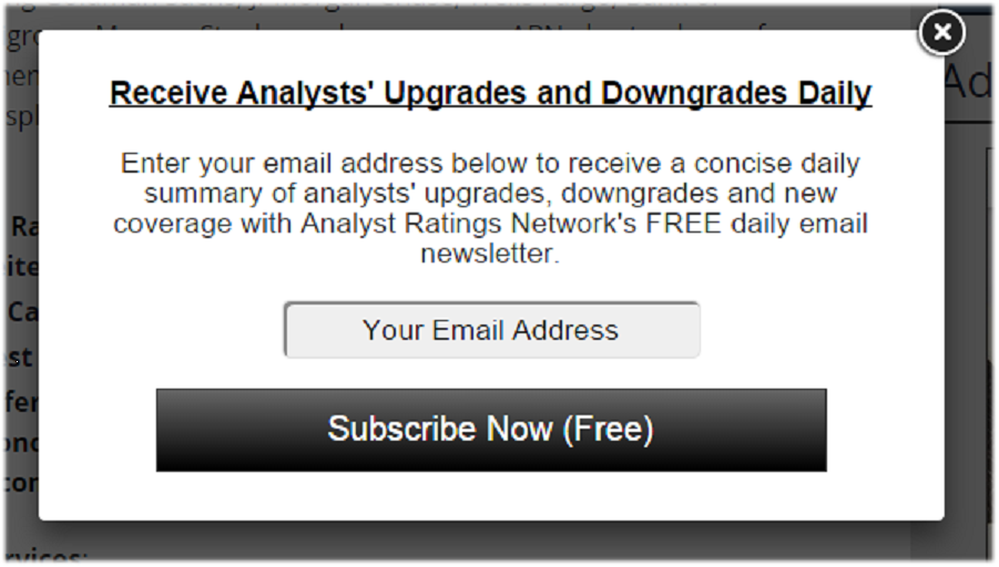
For the last three and a half-years, I have used a light-box popup as the primary tool for people to become aware of and sign-up for my email newsletter. You can see the pop-up I use by visiting https://www.analystratings.net/. As a result of more than one hundred split-tests during the last three years, this simple and straight-forward pop-up has resulted in the highest conversion rates. That is, until a few weeks ago.
After reading this tweet from Patrick McKenzie (@patio11), I decided to go through the process of finding my website for the first time, signing-up for the free email newsletter and becoming a customer.
Simple exercise: use an actual credit card to buy an actual copy of your product quarterly. That experience is important but hidden to you.
— Patrick McKenzie (@patio11) September 14, 2014
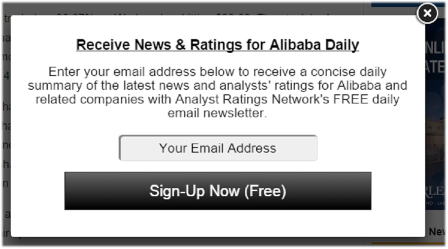
Since a lot of my traffic comes from financial news portals like Yahoo Finance, StockTwits and MSN Money, I decided to start on those sites and try to organically find my content. After going through this process a few times, I noticed that whenever I clicked through to one of my websites, it was to learn more about a news item for a specific publicly traded company. I wondered what the results would be if I were to try to make the opt-in more relevant to the reader by focusing on the company they were searching for specifically. After working on the copy, this is what I came up with:

I showed the original pop-up to half of the people that would land on one of my websites for the first time and the new version of the pop-up to the other half. The results were astonishing:

Both pop-ups lead to the same newsletter, but one is slightly more relevant to the reader than the other. Instead of offering the promise to send news about stocks in your email daily, the second offers the promise of providing news specific to the company you were searching for. The “company focused” copy resulted in an increase of 76.4% above that of the baseline copy.
There are a few valuable lessons to learn from the results of these tests:
- Pretend to be your customer. Go through the entire process of becoming a customer for your business periodically. Put yourself in their shoes so that you can find areas to improve.
- Always Be Testing. Your numbers will never be “good enough.” You should continually be running split-tests so that more of your potential customers actually become customers.
- Make Your Offer More Relevant to Your Customer. How can you change your messaging to be more relevant to your customer and what they are thinking about when they come across an advertisement for your product or service?

