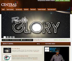
 I’ve recently gone through the process of building out a new website for my home church, Central Baptist Church of Sioux Falls am now in the process of building new websites for my friends at West Center Baptist and Trinity Lutheran Church of Madison, SD. As I go through the design and development process with these organizations, I am finding that having a church as a client is very much a different animal than building a website for a local small business or even other non-profits.
As a web developer, the first thing that I had to learn when working with churches is that you’re not just building for an individual that wants a website for his or her organization. You are probably working with a committee of volunteers or the staff members of a church. You’re also building a web-presence that has to serve a number of different purposes (outreach and assimilation, communication with members, encouraging members to get involved with ministries) and has to serve a number of different constituencies and ministry areas within a church.
Building a website that satisfies the needs of the different ministries of a church and makes all of the committee members and staff members is not an easy task, especially when you’re working with people that might not be the most tech savvy individuals. As a technologist, you might be tempted to dismiss some of the suggestions and ideas of the non-tech savvy people that you’re working with, but the key to making a successful church website is one that evokes buy-in from different areas of a church.
When building the latest iteration of Central’s website, I took a number of steps to include the various ministries of the church to make sure that the new website would meet their needs and make sure that the website was an effective outreach and communication tool. This started with the design process. I spoke with a couple of staff members about what some of the big-picture items (color schemes, navigation, content) they wanted on their homepage and in their design. I took that information and created a design competition on 99 Designs.
For $500, we got back about 20 different spec designs from designers around the world. I handed off 7 of the better designs to the church staff and told them to choose between those with the strict instruction that they had to choose one, and couldn’t pick and choose elements they liked from each one. I believe that single move prevented many of the classic “design by committee” mistakes. I did allow for a few minor changes to the design that they choice.
Once we had an approved design for the homepage, I brought in my co-worker Jason from Factor 360 to create a secondary template and splice the Photoshop file into HTML. We then integrated the designs into a copy of Drupal (probably not my first choice of CMS, but that’s what the church’s technology team insisted on, so, I rolled with the punches).
When moving the content from the old site into the content management system, I found that several sections of the website were not up-to-date. I worked with ministry leaders in a number of different areas to get fresh content. I wasn’t able to get content from every ministry area, but most were very helpful.
After the site was ready to go, I created accounts for each member of the church’s ministry staff and did a couple of hours of training to show them how to update various areas of their website. Not everyone picked-up on the training, but many of them did and those that did are able to help out those that are less tech savvy.
Training a church’s ministry staff to update their own website is a critical part of the process. You cannot build a church website and never update it. That would be like creating a template for a church bulletin and not updating it from week to week. As the site’s developer/designer, you probably don’t have time to update the site on a regular basis, but you can train the church’s ministry staff to update a lot of the content on the site and rely on you as a back-up when they run into a wall.
We’re now about six months into the new website. The ministry staff is happy with the website (I believe, in large-part because they were involved with the process) and the congregation has been using the site much more now that the site is easier to navigate and updated on a weekly basis.
If we made any miss-step in the process, it was switching domain names. We had the domain central-baptist.org which was first registered in 1997 switched to the domain centralsf.org for the new site. As a result of this, we probably lost some authority in search engine rankings, but, hopefully that will improve over time.
